
YOU’VE BEEN GIVEN THE GREEN LIGHT! WELCOME TO MY WORK.
The New York Times
2022 (10 weeks) / Product Designer
COLLABORATORS
Reed Reeder (PM)
Gaëlle Sharma (PM)
Alexander Lang (Engineer)
Olivia Cheng (Design/Manager)
SKILLS
Product Thinking
Prototyping
User Research
Visual Design
CHALLENGE
Login has now become a puzzle due to the addition of social sign on options when creating a new account: did I connect this account to my Facebook? It requires good memory, luck, or a solid password manager.
This is a common problem, as ~60% of new registrations are through Google one-tap and Continue with Google login methods. By fixing this problem, we can help to:
01 Reduce customer care complaints, 02 Increase the number of new registrations, 03 Reduce duplicate accounts
CONTRIBUTIONS
→ Shipped login improvement impacting 60% of SSO users
→ Facilitated workshop to generate backlog of improvements
→ Designed various flows to guide user to correct account
→ Ran usability testing to validate design solution
→ Built component and documentation for developers
FINAL PRODUCT
01 PROBLEM EXPLORATION
Where can we insert design thinking into the login experience?

Untouched by ✨ design ✨ , it’s time to update some of our legacy pages.
Screenshots of the FigJam board after the workshop had ended. The sticky notes indicate potential problem areas that users could run into during the journey.
The bandwidth of an internship + the impact of the problem led us to our decision.
The digital paywall was announced in 2011 and since then, little to no changes have been made to many of the functional experiences at The Times in terms of design updates and improvements.
As such, many issues emerged within the new factors to consider: social sign on authentication, magic links, and multiple accounts. I designed and co-facilitated a workshop in FigJam to gather these problems.
Inviting folks from the Growth teams (such as Customer Care, Account, and Identity) allowed me to hear multiple perspectives on the issues each team faces within this problem space.
Synthesizing the results with my product manager and design manager, we were able to gather a list of solveable problems to tackle. We chose this specific problem of Google SSO because of two key reasons:
01 Large Impact
as 60% of our users are authenticated with Google.
02 Low Effort
Design/engineering lift would be possible for internship project
Problem Statement
Design a guardrail solution for users authenticated with Google SSO, who attempt to sign in with an email address.
02 CURRENT STATE AUDIT
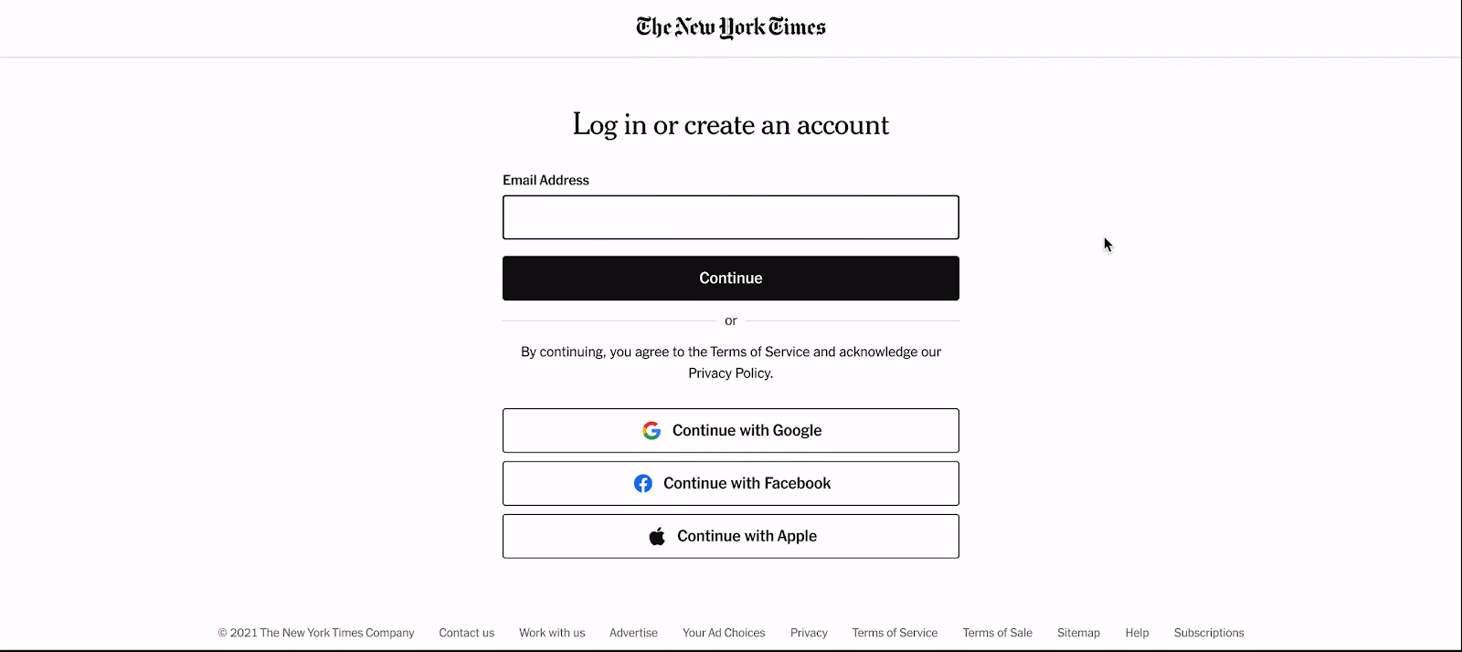
Creating new accounts is easy, almost too easy.
Pinpointing the problem area of the experience 📌
I conducted an audit of the current state to understand the friction points in the user journey when logging in using an incorrect form of authentication. This journey was so seamless and quick, which led to key hypotheses on why this was a problem:
01 Users forgot their initial login method, and typed in their email address with the expectation of being led to the right place.
02 Typos in the email address field led users to mistakenly create new accounts.
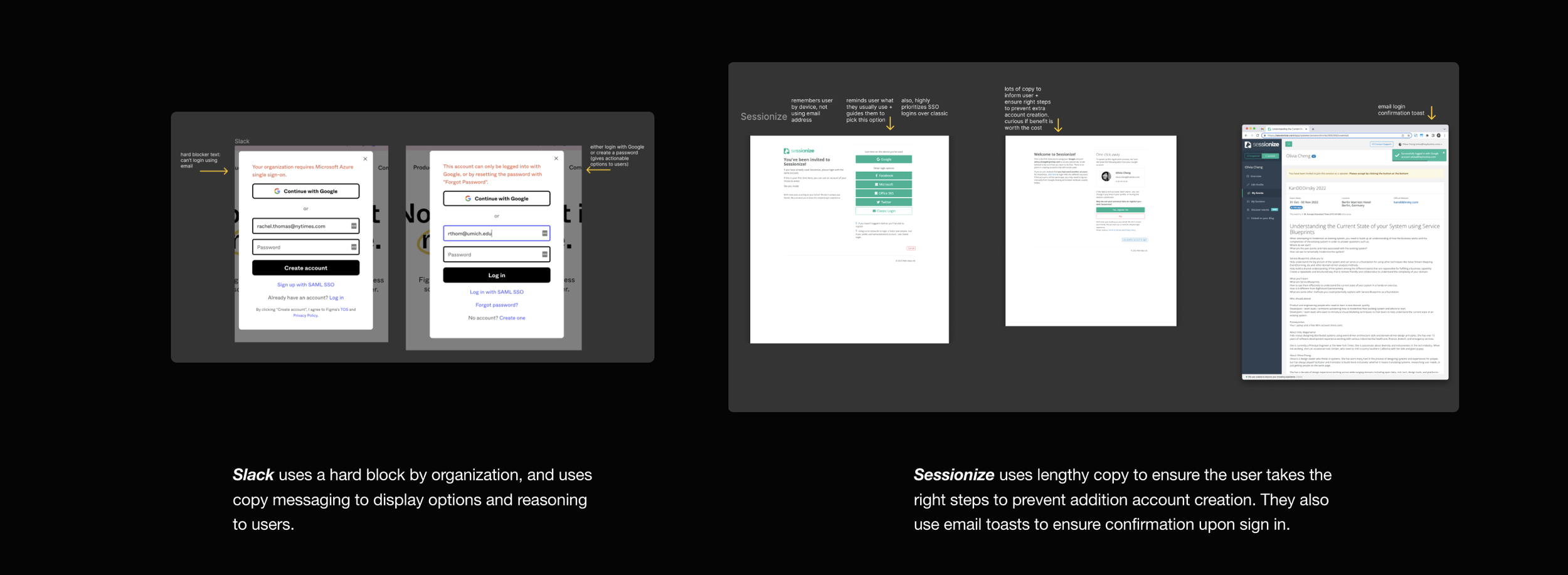
03 COMPETITIVE ANALYSIS
How might we direct users to the right account?
Logging in using SSO isn’t a new invention- many companies use it to give users autonomy and quicken login speed 💨
I took a look at some other companies flows on how they handled this exact authentication mishap and ways they introduced friction.

04 SOLUTIONING
To what extent do we want to guide our users?
A question of giving users information to make their own choice, or directing them to the preferred choice 🤨
The following iterations are based on giving the users varying levels of information and guidance when logging in.
During this iteration process, the PM’s voiced that we could not create any definite hard blocking experiences because easy access is critical for readers. This automatically ruled out the first iteration.

EXPLORATION
A hard block, which eliminates the potential of a user creating an unecessary password.
There’s clear messaging that directs you exactly where to go.
Product Concerns
What if it’s a typo? There’s nowhere to go from here. In general, we should avoid definitively blocking a user from logging in.
Design Concerns
There’s a clear contradiction between the tone of “typically” which reads like a suggestion and the red alert icon, which is a definitive block.

EXPLORATION
By stopping users before they get to the login form, they don’t need to wonder about what their password is.
Instead we can directly point them to the create password flow while also reminding them they usually use Google.
Product Concerns
This is still, in a way, a block, because the Continue button cannot be clicked.
Design Concerns
Will the error be confusing because there are two messages and options being communicated?

EXPLORATION
A message sharing what login message the user typically uses.
This method guides users towards picking the easiest path right away, before they type. It’s a reminder to infrequent users that they’ve been here before, and that they have an account.
Product Concerns
Will this work across devices? The cookies aren’t shared. It also doesn’t solve the issue for users who have multiple Google accounts.
Design Concerns
This has the potential to be 10x more confusing if executed incorrectly. Also, unsure if we can legally move the “Continue with” button order.
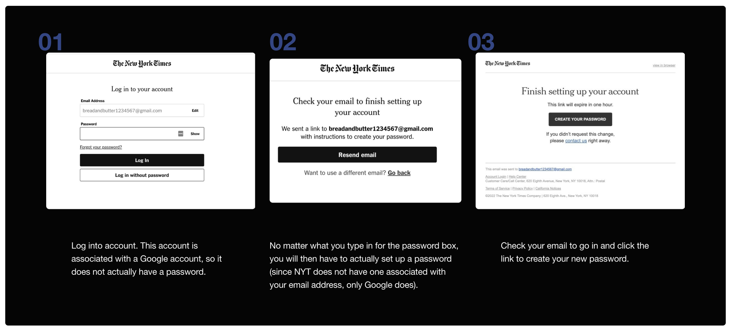
Where in the flow should we intercept the user from making a potential mistake?
Users would not want to create a password if it was unecessary to do so; however, we still wanted to give them the option to do so if that was truly what they wanted.
Ultimately, the fourth iteration was chosen as we wanted to prioritize a seamless experience that acted in the user’s best interest by doing the least to confuse them while still providing options.

EXPLORATION
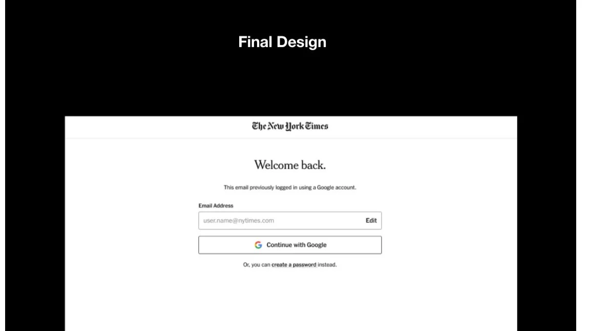
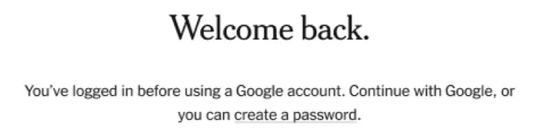
A guiding path to lead users to automatically log in through Google ⭐️
Once a user types in the email address, the system will recognize their authentication credentials and guide users to continue using Google. Though there were concerns of this screen being an extra step (which could be seen as frustrating), we believed this option gave users choice and guidance at the same time.
05 DESIGN DETAILS
How can we appropriately use a design system to create a new experience?
All the little details are important for consistency, given the large scale of the brand.
I went through another round of design iterations, focusing on the visual design. I had to ensure the choices I made aligned with our design system’s component guidelines. Some of the choices I considered:
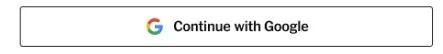
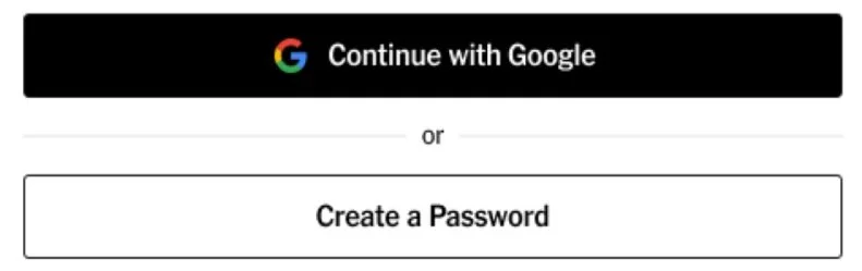
Button Color
Using a white “Continue with Google” button instead of black for visual consistency with the previous screen, so when prototyped the same button can slide up to the position where “Continue” button is.
👍
Icons
Which icons feel the most relevant to user understanding, and where? We decided to keep it simple, opting for no Google or green checkmark, as that felt more like a registration design rather than a login one.
👍
Create Password:
Using a text link instead of a button to decrease visual weight, guiding users to SSO.
👍
06 VALIDATION
Does the design fit into the bigger picture?
Now that we had the design, I wanted to ensure the flow worked in the larger context of login using 4 internal usability testing sessions.
Four users validated the design in context of a user logging into the Times.
The Times has limited access to UX researchers and the budget for research is tight, so internal usability testing was the ideal option for testing. Privacy is a major reason why most testing tends to stay internal.
Below are some highlighted quotes. I organized my findings into Dovetail and created a list of insights based on user feedback.
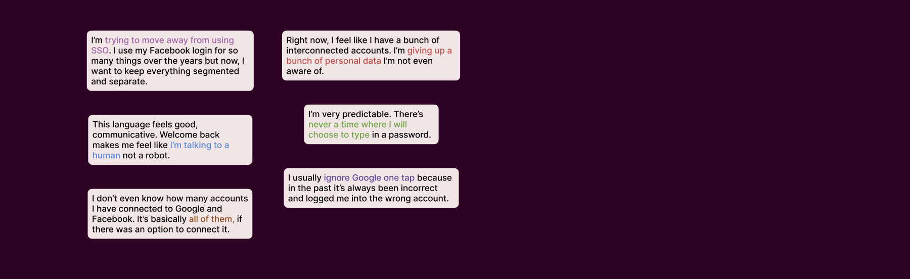
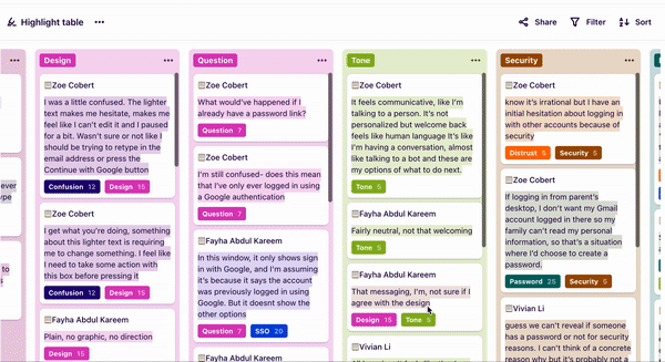
Be careful with the terms you are using.
My biggest takeaway from usability testing was to use language that fit other people’s mental models. Sometimes, it’s not about using the least technical word, but the most specific and relevant.
This meant adjusting the copy to read “This account previously logged in using Google” instead of previously, where it read “This email previously logged in using Google”.
I shared my learnings with my team to help the adoption of design thinking.
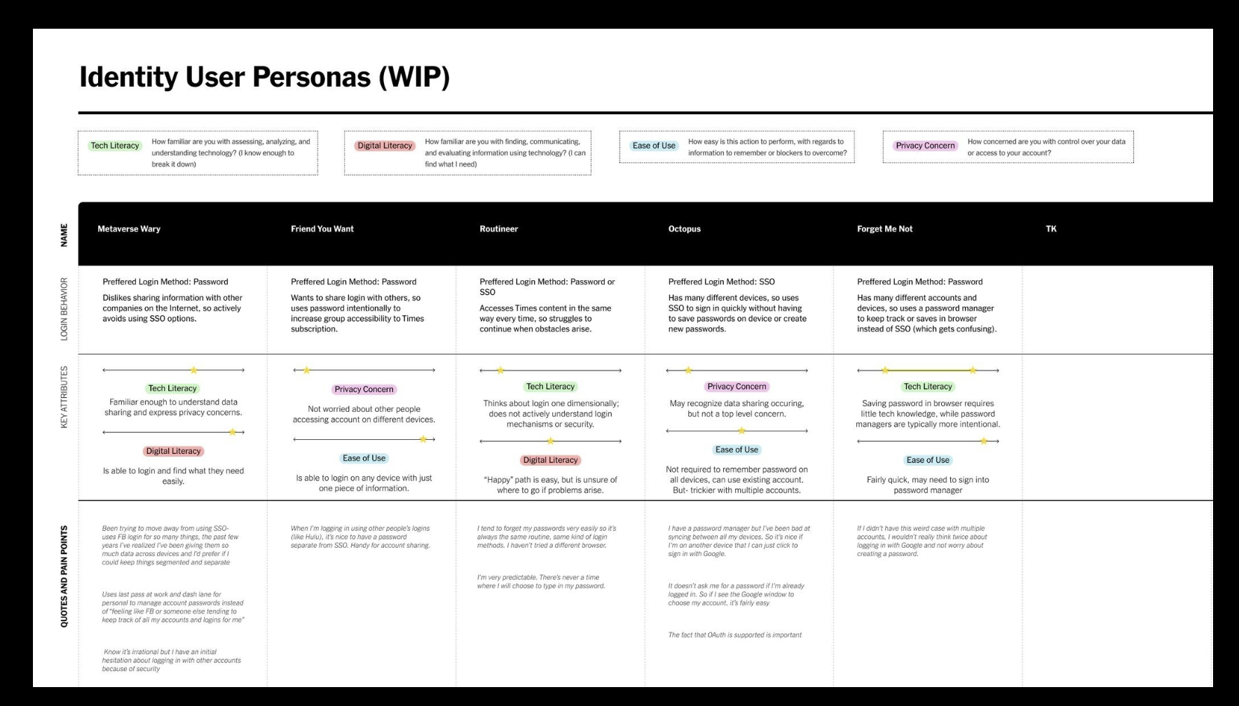
After hearing about the many ways people deal with login security (writing down all passwords on paper, using a password manager), I created an initial draft of user personas to push design understanding forward for my engineering team.
This is a growing effort in embedding our engineers within our design process and helping them see the login problem space as not just a one-dimensional login form, but an area used by people with a wide range of motivations and behaviors.
07 HANDOFF & DOCUMENTATION
All set- let’s hand the designs off… to new developers.
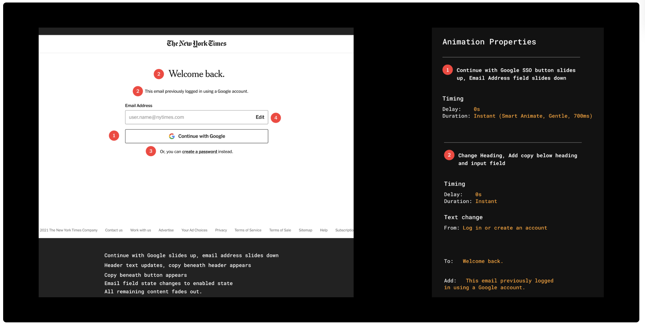
Working with new contracted developers from Ukraine (who had never used Figma) meant detailed documentation.
I documented animation specs for developers in Figma, which guided them in the implementation stage of the project.
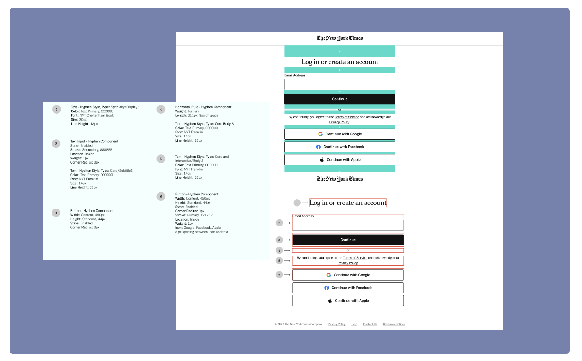
I had to understand and implement a new (and quickly growing) design system.
As a side project, I reskinned all (17) login and registration screens using the newly adopted Hyphen design system. This meant understanding the guidelines of components and how to appropriately apply the system. I documented animation specs for developers in Figma, which guided them in the implementation stage of the project.
Reflection
Working for a company with a mission as inspiring as The Times was a dream come true.
This summer was full of growth, as I was able to apply a design lens to a problem space typically unfamiliar with product design thinking. Communicating the importance of design, explaining rationale and thought processes to developers and PM’s, and breaking down complex systems helped refine my critical thinking and communication skills.
Huge thank you to my manager, Olivia Cheng and mentor Elisabeth Chin for supporting my learning and trusting me enough to think through these design challenges.