
YOU’VE BEEN GIVEN THE GREEN LIGHT! WELCOME TO MY WORK.
The New York Times
2022-2023 (2 months) / Product Designer
COLLABORATORS
Reed Reeder (PM)
Gaelle Sharma (PM)
Alexander Lang (PM)
Olivia Cheng (Design Manager)
SKILLS
Product Thinking
Systems Thinking
Art Direction
Content Design
CHALLENGE
The error pages for NYT haven’t been updated… ever. They are in desperate need of design and usability improvements.
A service outage at the platform level can have widespread impact across the Times, blocking users from essential news, trusted recipes, or morning rituals (like playing the Wordle right when it drops).
When a user runs into a system error during a login or registration access point, there’s no way for them to understand what has happened which can cause frustration and dropoff.
CONTRIBUTIONS
How might we improve the experience so that when system errors and outages occur, our users still have a clear path forward or around these moments? I delivered the following:
→ Responsive design solutions for error pages
→ Service blueprint outlining error handling process across NYT (surveyed 5+ product teams internally)
→ Diagram outlining expected error states across NYT
→ Supplemental solutions (quick wins) using design system
FINAL DESIGNS
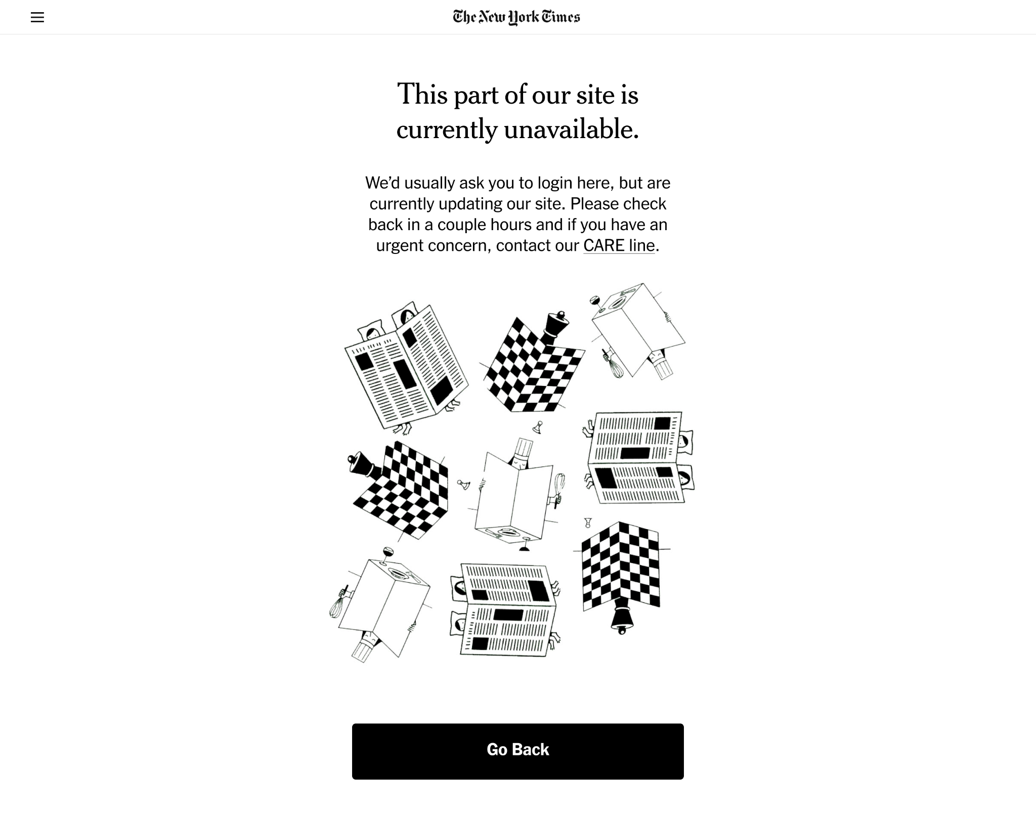
Full page, standard view
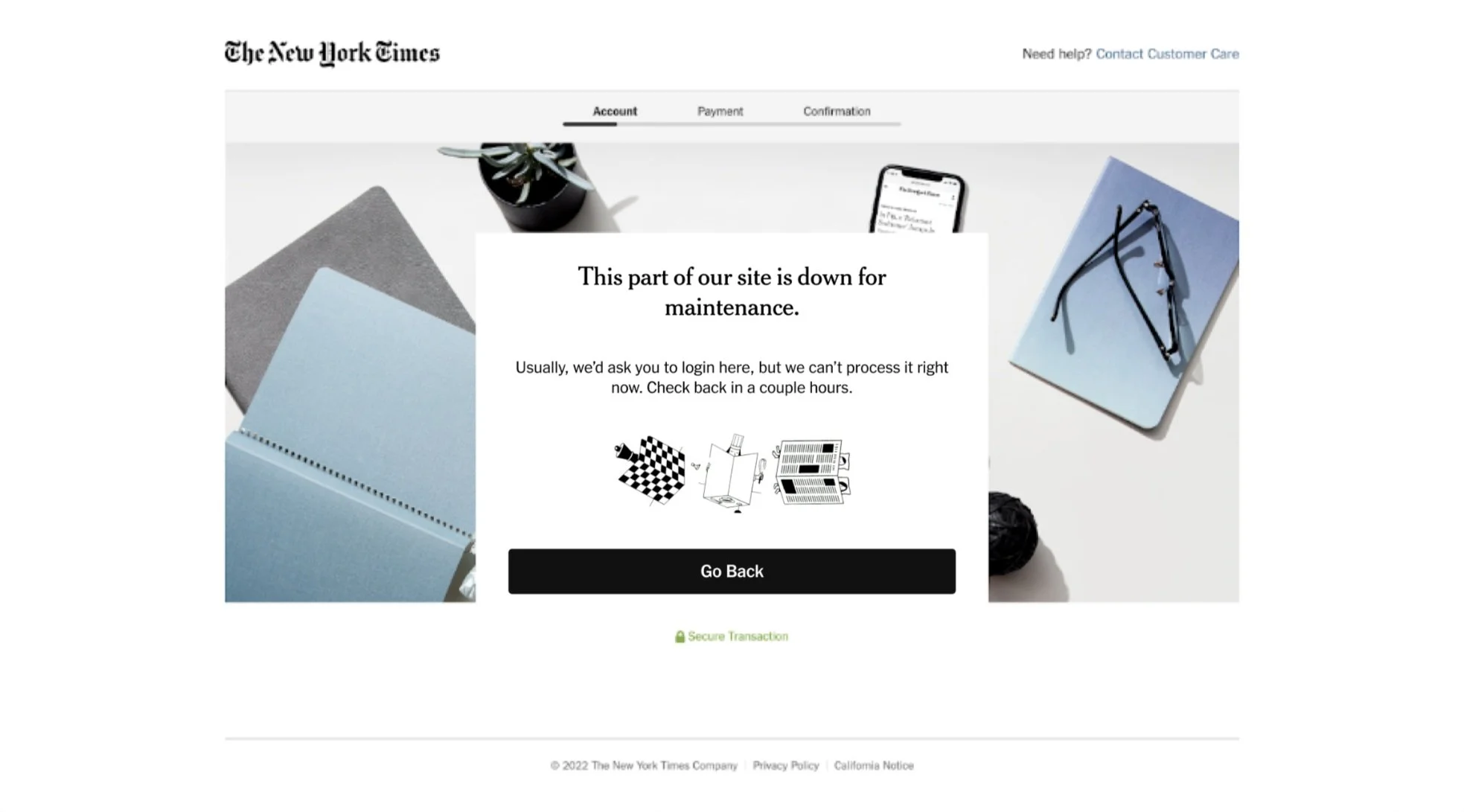
Payflow View (when buying a subscription)
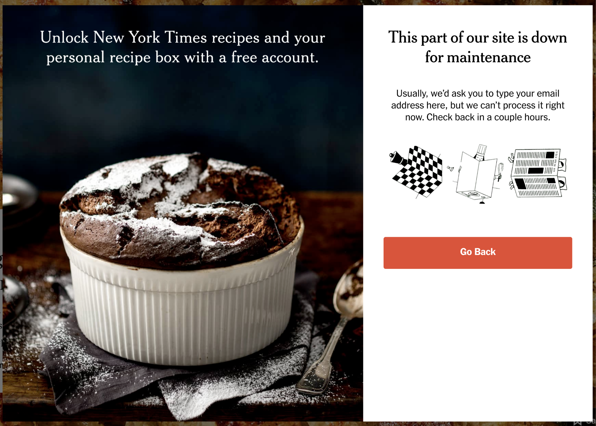
Cooking/Wirecutter Embedded View (when viewing subscriber-only content)
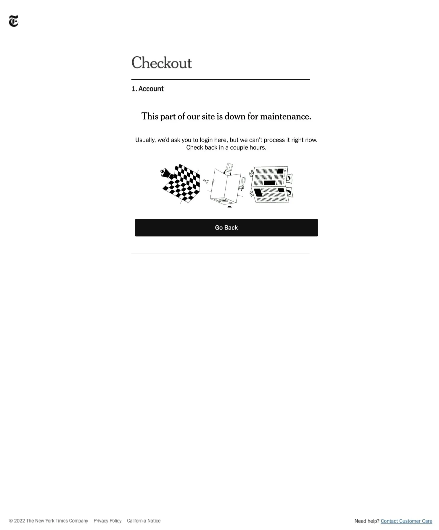
Checkout view (during the payment process)
00 DESIGN PROCESS
The process I outlined and followed for this project
Intention behind my actions 😇
Documenting this early on helped me to outline necessary steps, but more importantly, helped me understand and explain why each step was important in the process. Click on the process diagram to read more!
01 EVALUATING THE CURRENT EXPERIENCE
These blank error pages aren’t that surprising…
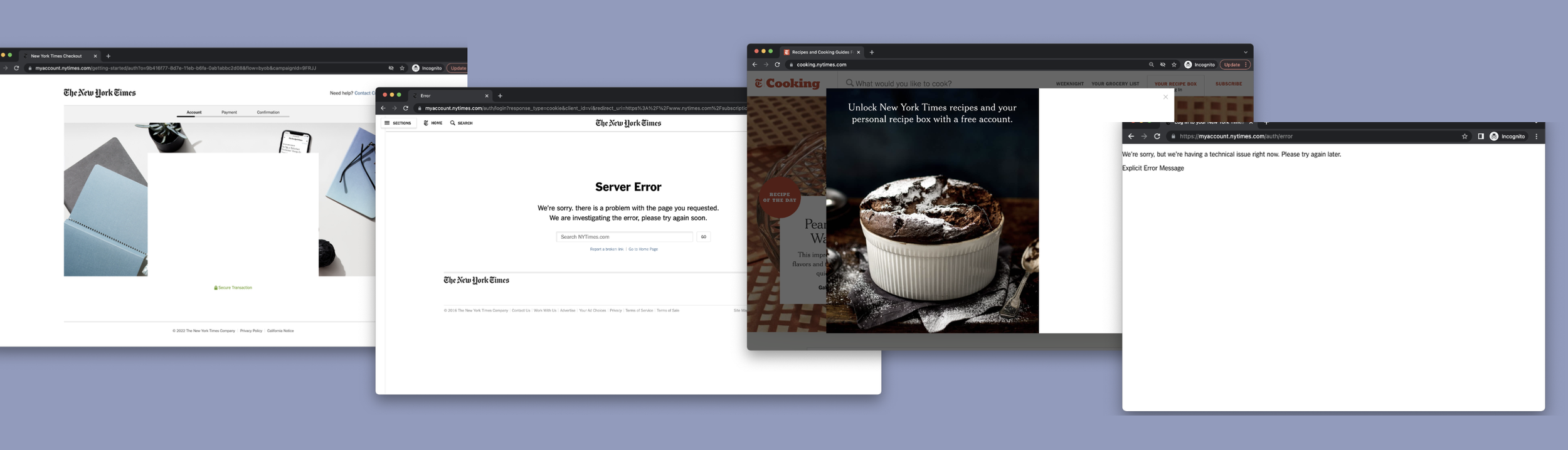
Because of the quick adaptation from paper to online subscriptions, the Times didn’t initially think about the non-essential pages on their website.
Many legacy systems are still being used today.
Why should we care about an error page? Isn’t this just a functional thing? 🤨
By improving the experience in the moments when LIRE does fail or produce an error, we will be able to maintain trust with the user.
We can also be more helpful: let’s respect the user by helping them understand what has happened and give them the best shot at recovering from the degraded experience.
02 DISCOVERY
Let’s dig into the technical background
There are two types of errors we need to solve for.
I held a long Q/A with the engineers and PM’s on the LIRE team to learn more about the system and backend teams currently handle errors.
01 Expected Errors
Expected server errors are a result of coordinated downtime. These are typically outlined during H1/H2 planning and multiple teams are involved in this effort.
02 Unexpected Errors
Unexpected errors can happen, and the time taken to fix them ranges based on how quickly the problem is found and coordination efforts between teams.
Sometimes, the alignment between teams to take action (turn meter paywall off) can take longer than actually fixing the problem.
5 different teams work together to make this happen.
Current Error Handling Process
01 If there’s an attempt to log in, an error message “couldn’t complete request” pops up.
02 Otherwise, a general error page that comes up. Since we share the login form with other teams (payflow, account), we apply a blanket maintenance page.
03 If you can’t login, it’s unlikely that you can access anything else. So. we ask meter team to stop “blocking” articles while we’re doing maintenance
Below, I created the diagram on the left to illustrate the time and effort necessary for a maintenance page to go up based on the information I learned from the different product teams involved.

As the diagram illustrates, it takes 2.5 hours the night of plus pre and post effort to ensure the entire process operates smoothly.
The grey boxes on the bottom of the graph illustrate different opportunities, such as
“How might we automate this process?” or “Could we conduct smoke tests to test if our system can handle these requests?”
Business Opportunity
By enabling a better system maintenance process, we can be down for less time, helping our users access the Times.
This process requires a team effort 👬
03 SYNTHESIS
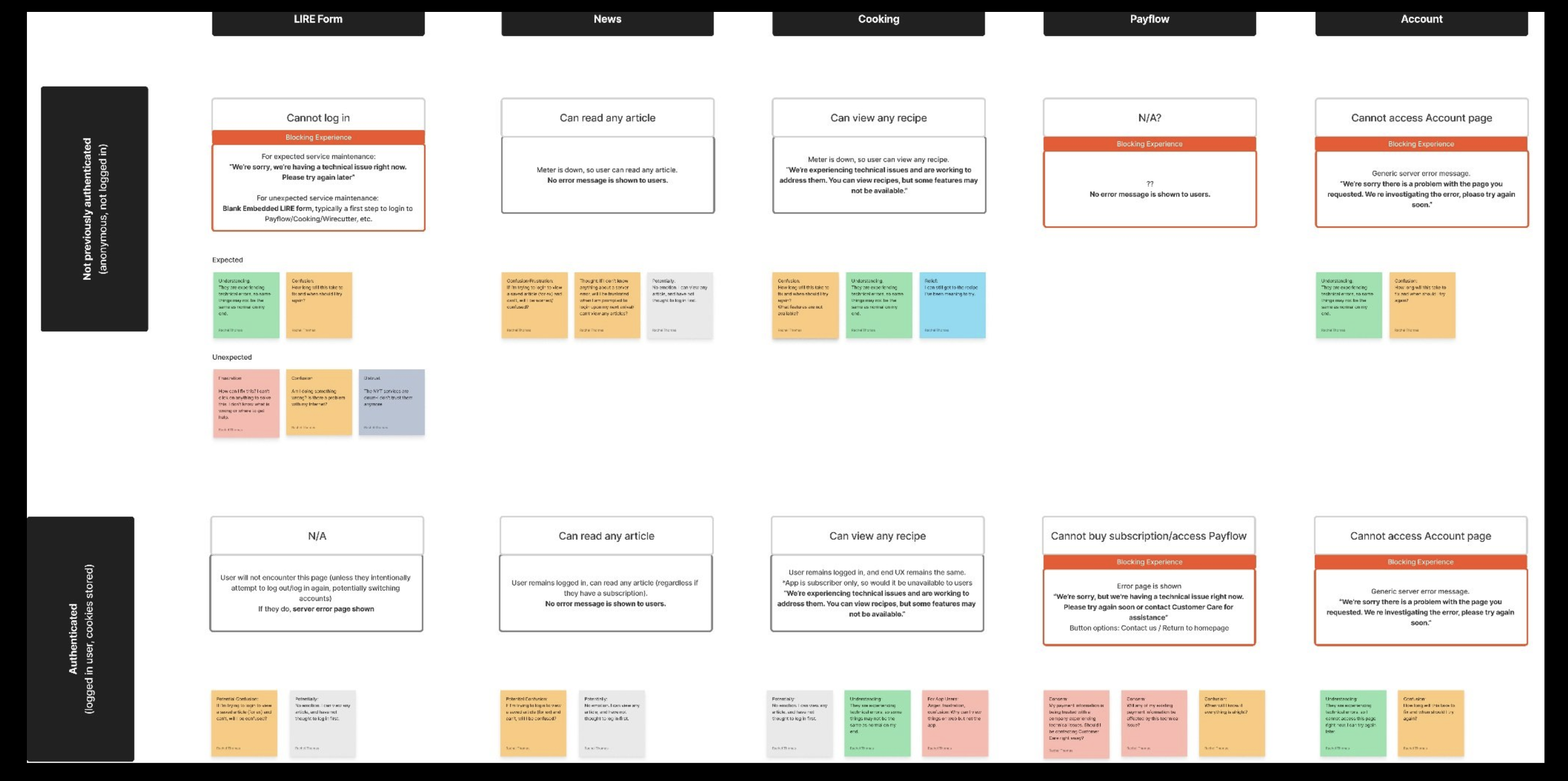
Error states in the NYT ecosystem
Many NYT products, many reasons to log in, many ways to run into an error
Depending on the user’s authentication state and point of access, they may be shown a different experience during a time of error.
I created the diagram below to catalog the experience the user runs into based on their authentication state and which Times product they’re trying to access.
The boxes in RED highlight blocking experiences for users, where they cannot complete their intended task and are given an error message. These are the instances where our error pages can serve to be the most helpful.
03 COMPETITVE ANALYSIS
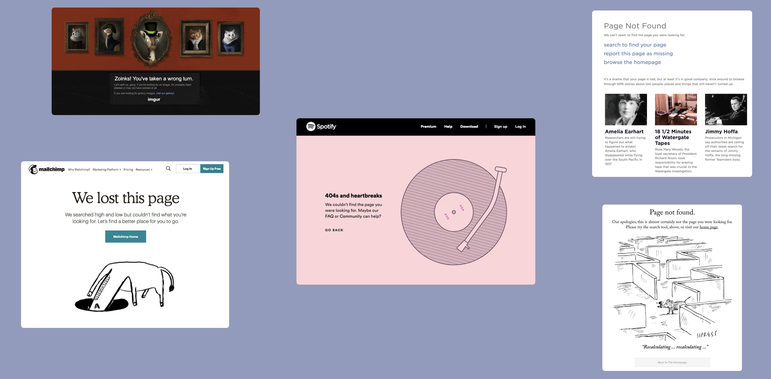
Brands have personalities, too. Let them shine.
Error pages are the perfect opportunity for play🛝
In many business messages, it’s hard to show users that there are real humans behind the work without seeming phony or trying too hard. However, error pages are the perfect opportunity to be playful- it’s an experience that’s annoying, and can show that a brand knows not to take themselves too seriously.
This confirmed the direction of my redesign- how can we show our readers/game players/home cooks that the Times is a brand that has personality?
04 SOLUTIONING
Branding for our everyday subscribers, not just the serious readers
Highlight the bundle of products, or focus in on one at a time?
The following explorations are rooted in exploring a “set” of error pages - which meant that each team could focus on their respective error page process, or a unified error page - which meant that one team could be in charge of putting up this page.
CONCEPT
Using existing mobile assets and playful copywriting.
While this was the easiest design to assemble due its reliance on existing assets, it ultimately did more to confuse users in some instances. Devil’s Food Cake is a tongue-in-cheek way of displaying an error related to NYT Cooking (devil = bad), but the connection was not direct enough to make sense to most users.

CONCEPT
Using existing brand assets and playful copywriting.
This design also relies on existing assets in a way that makes more direct sense due to using icons within the brand instead of relying on real screens of a product.
However, there was still a reluctance of using real brand assets in this instance. We have serious readers who may be confused by what they see on the screen. Moreover, not EVERY NYT product (Wirecutter, The Athletic) for example had an asset that could be used in a way that would make sense.

I moved forward with this concept because it had the most potential to work across products and be the most flexible across devices.
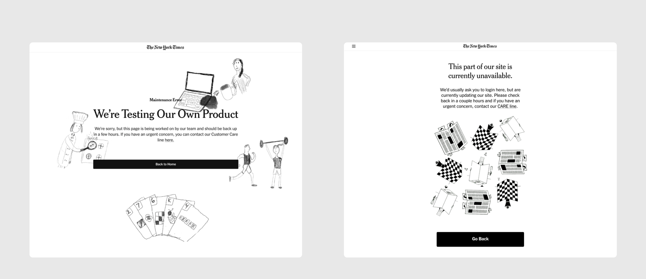
Illustrations were a way to create a playful tone to the page without using 1) NYT exisiting assets (which may have confused users) and 2) quirky copywriting (which doesn’t quite match our overall brand voice).
The version on the left is a first draft, using my own sketches to illustrate the different NYT offerings. We then took an illustration published in a previous edition and refitted it to a “grid format” (right version) to ensure that we could scale it across devices and use cases.
CONCEPT
One generic error page with illustrations that speak to all NYT products
I also created a set of supplemental designs, meant to give the user a warning.
Before the user runs into a “blocking” experience where they are unable to login when paying for a subscription, trying to check their Wordle stats, or looking for a saved recipe, these helper messages lessen the disappointment and give them a heads up.
These were easy to implement and build due to their reliance on exisiting design patterns.
Heads up- there’s something wrong! ⚠️

As a disclaimer, this was an exploratory project which was never shipped.
This was the last project I worked on at the Times, so I am unsure what the current state of our error pages are now.
If anything, this work shed light on how degraded experiences could be upgraded and how to appropriately showcase a brand through design and copy.
If I had more time, I would’ve loved to have animated these illustrations- this page to me is itching for some playful movement!
Reflection
Working for a company with a mission as inspiring as The Times was a dream come true.
I was able to turn to sketching when I felt limited by assets, which ended up leading to my solution.
Another valuable lesson I learned was creating diagrams to synthesize the information I learned which helped me to present my knowledge and fill in gaps.
Huge thank you to my manager, Olivia Cheng and mentor Elisabeth Chin for supporting my learning and trusting me enough to think through these design challenges.