Lucas Howard Group
Analyzing the homepage experience for customers interested in viewing real estate virtually.
I worked here from June to August of 2020.
ROLE
Web Design Intern
COLLABORATORS
None
SKILLS
Wireframing
Heatmap Analysis
Google Analytics
TOOLS
Wix
Hotjar
SOLUTION
My task as the Website Design Intern for the summer was to redesign the homepage to increase the aesthetic and functionality of the website. I restuctred information hierarchy and flow, and improved the visual design of the website.
CHALLENGE
With the COVID-19 pandemic, customers cannot visit houses and offices with as much ease as they once did. The website had been used for 16 years and instead of providing a platform of coherent information, it just added to confusion. They wanted a modern and visually appealing homepage that reflected their values of community and personality.
01 HEATMAPS
I looked at heat maps generated from Hotjar.com. The “click” map showed that the most number of people were clicking on the Our Team section- 91/336 recorded, or 27% of the overall clicks. The second most relevant spot on the website was the Home Search section - 29/336, or 8.6% of overall clicks. Finally, the More section generated 21/336 clicks, or 6.25% of the overall clicks. After these, the numbers dropped off but the other most trafficked parts of the site were the Contact Us Form, the Local Listings section, the Blog section, and the Sell Your Home button.
Using the “scroll” map, I found that only 75% of users were reaching the “Contact Us” form. This form is partially visible even by the initial frame of the homepage- so this is concerning. Only 50% of users are reaching the “Recommendations” section which is especially important in differentiating the company from the many other real estate companies in Grand Rapids. Generally heatmaps follow this pattern of dropping off gradually as the page progresses and information becomes less relevant; however, the severity of this drop off so early on in the page is alarming.
02 COMPETITVE ANALYSIS
As this was my first project, I started by taking a look at around 10 other real estate companies in Grand Rapids to get ideas and inspiration for how to structure and design the layout of the homepage. This analysis helped identify different trends within the real estate industry.
We found that emphasizing the community was done better on other websites, with references to their latest blog posts or coronavirus updates. From my research, I found that putting the agent first is more important than talking the company up. Websites should prioritize finding a home, not a house. Search tools should be easy to navigate and CTA forms are important in securing contact information.
03 WIREFRAMING
After getting my initial mockups reviewed by the marketing director and CEO, they had some business requirements that had to be on the website. Firstly, they needed the “endorsement” videos from Barbara Corcoran and Kevin Harrington on there, though I suggested just name dropping to avoid taking up too much space.
Secondly, the Wix platform did not allow for blogs to be set up the way I wanted. I had to use one of the preset designs that Wix had for displaying blog posts on the website.
05 DESIGN
From my research, I identified that the three main things people were looking for when navigating to a real estate website was buying, selling, or finding their home value. Putting buttons linking to these three ideas at the main section of the homepage makes it easy for users to find them. The CEO requested two additional buttons- an "Instant Offers" and a "Contact Us".
I changed their “Who We Are” section. Previously, it included a lengthy text blurb with mentions of awards they had won, but the information was hard digest. I added icons and snippets of their most relevant statistics (such as how many houses they sold in the past year) to keep it easier on the user's eyes while still conveying the same information.
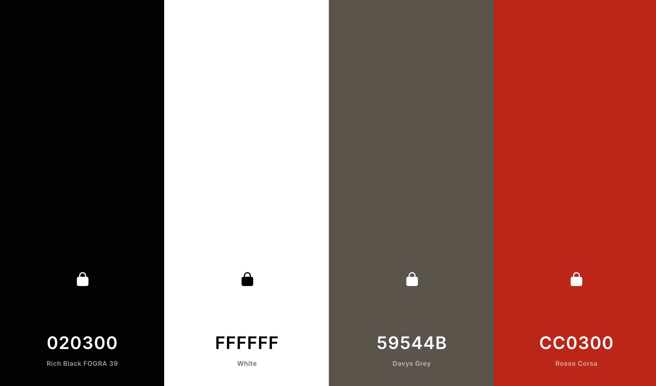
Finally, I cleaned up the color scheme of the website, opting for mainly red with white and black accents to simplify the scheme.
06 TEST & RESULTS
Due to the time constraint of this project, I was unable to test this version of the website. After reaching out to my manager, I learned that the average session duration of the user increased by 18% to 1 minute and 59 seconds in September. Additionally, the number of clicks increased by 112%, from 336 in the month of June to 715 in the month of September, indicating that more users were interacting with the site. The website is still in process, so I will continue to update this pages as changes become public.
Reflection
Constraints of Platforms
The hosting platform was Wix, so I had to work with pre-designed templates. There was slight autonomy over some design decisions; however, for a lot of my ideas, there was no way to implement them because Wix did not allow it. Moving forward, I would like to design on a platform where I have more creative freedom.
Constraints of Company
Because my company was not familiar with design processes, they asked me to prioritize my efforts on the visual aesthetics of website. Research was conducted with the resources available to me: the internet, clickmaps, Google Analytics. I felt that my designs lacked the user's perspective because I was unable to conduct any user research.
Collaboration is Key
As the only designer on this project, I had no one besides the marketing director to bounce ideas off of. Even when I showed my designs to others, they were quick to give judgement and move on because they were not personally invested in the project. I missed working with others and am looking forward to more team-oriented projects.


